Showing posts with label Art. Show all posts

28 May 2016

Light in the Forest

The conceptualization for Light in the Forest began with a desire to experiment with metallic colours. Adding blue to my palate helped the silver and gold pop. As I developed a theme that would complement the golds and silvers on my palate, I felt that a mythology based theme would work well. In this painting the viewer is peering into a forest clearing, where nymphs are dancing. As they dance they bring life and light to the night forest around them, which baths the forest in hues of gold and silver.

I started this painting expecting that I would finish it before medical school, but as it was I started school a semester earlier than I originally planned, and didn't finish the painting. When I began clinical rotations, I thought that I would have more time to paint, so I took the painting with me from city to city, as I traveled to each rotations. I quickly learned that I would not have as much time as I had anticipated, and it took me the whole remainder of my medical education to finish the piece. I sketched the piece and painted the background in Salt Lake City, UT, my home. Then I made background adjustments in New York City and Detroit. The forest was painted at my parents home in Saint George, UT, at my brother's home in Salt Lake City, and in Shreveport Louisiana. I painted nymphs in New York City, Cleveland, and finally finishing the painting at my brother's home in Salt Lake City.

From my sketchbook to the canvas.
Staining the canvas.
Painting the night sky.
Painting the forest floor, which I repainted three times in three cities. 

Sketching in oil tree branches.

I painted the foreground trees with a palate knife. Here the foliage is done in silver and pewter mixed with ivory black.

Painting the tree trunks with a combination of gold, Renaissance gold, and burnt umber. 

My beautiful wife is painting a miniature version of my painting, although she says her nymphs will be clothed.

Mixing skin tones was an uncharted territory for me, and I spent many hours sitting at my palate mixing paints. In the end, I felt I did reasonably well for my first attempt at painting the human form. Upon completion, I gave this painting to my brother, Steven King.

"Light in the Forest" 2016
Oil on Canvas

21 January 2015

Crux Invicta 2015

A painting for my mother-in-law to be.

Stage I: Prep 
Stage II: Laying down a foundation of colour. 
Stage III: Blending
I wasn't really happy the results so I decided to start afresh. 
I wanted more of a glowing feel.

But ended up with more of a sunburst. 

"Please, Hunny Bunny, can I paint too?" 
"Ladies and Gentleman, I present to you..." 
"Crux Invicta" 
"Ta da."

"Look at me! I'm an arteest."
"A little dab of paint here, a little there."
"Hmmm, I think it is missing something, ahh yes, the cross.." 
Phase IV: Palate knifing in the cross.

I do contortionist work on the side. 
Behind me, that is Assyrian for: "You are in trouble Mister.", because I'm taking a selfie while standing on a chair.  (Really, I was using the phone camera, like a mirror, to view the top edge of the painting better,  but shot a selfie while I was at it.)

Crux Invicta 2015


30 January 2012

Sweethearts

My manager and friend, who I have worked with for so many years, throughly enjoys teasing me. One of her favorite jabs is to tease me about my choice to not date. She gets on my case more than my parents, who know the topic is taboo. A few years back I cleverly turned her teasing on her by saying, "Chris, the only girl for me in this world is your daughter, and I will have no one else". The reaction I got was great. She proceeded to tell me that I would never want her daughter for a wife, because she has ruined her daughter by spoiling her, and her husband will have the most spoiled wife in the world. I retorted, "Chris, who better to marry your daughter than myself? No one would spoil her more than I would." Mind, I am only joking with her, I'm closer to Chris's age than her daughter's, who was only fifteen. Admittedly, I like to tease her as well, and when ever I get the opportunity to tease Chris about her daughter I do, often referring to her daughter simply as 'my wifey'. Thus you can imagine I couldn't resist the opportunity to write a valentine for Sommer (Chris's daughter) when Chris brought a stack of cards into work on Valentine's Day. (The purpose of the cards was to give them to coworkers who were great teammates.) Chris likes to tease her kids too, so she gave it to her. A year later I wrote a short Valentine's Day poem for Sommer. It's become somewhat of a tradition, so for this year I decided that I would make her a valentine. Sommer is quite artistic, and honestly a better artist than myself, so I thought that she might appreciate a hand painted valentine. It's not my best work. I was trying to paint it rather quickly, after all, it is only a running joke.
"Sweethearts" 2012
Oil on Canvas
9x12"

03 November 2011

Colours of Spring

"Colours of Spring" gives representation of the vibrancy and life of Spring, as the world comes out of the long and dreary of Winter. Accordingly, you will find this piece to liven up the room with the bright and richly textured flowers popping out from the surface of the painting. I chose the dimensions of the painting with the idea that it would best be showcased above the archway leading into a room, inviting guest to feel enlivened by what lies beyond. It began as simple painting that I intended on completing in a single session working wet-in-wet, or alla prima. I wanted a bright painting with spontaneous brush strokes. I painted a rainbow of colours, from deep alizarin crimson to the jewel like French ultramarine. After combining primaries to make secondaries I placed dabs of titanium white paint directly from the tube on to the canvas. I then proceeded to spread the white paint into spring flowers, creating a tint of the colour below. The idea was that the background colour represented fields of flowers that blended together on the horizon creating a single mass of colour, while the flowers in the foreground were close enough to distinguish.
Original composition.  
The unfortunate nature of oil paint is that it leaves your painting vulnerable to the environment for an extended period of time while the paint dries. As a result of my negligence to protect the painting during this critical time a thick layer of dust was cemented into the wet paint from the air conditioning vent above. I was rather dissatisfied with the results so I sanded the painting and began afresh. Yet, I could not simply repaint it as I had before because I had used thick paint, resulting in obvious brush marks that would not match between the old and new. To solve this problem I decided to magnify the textural difference between the flowers and the background by using a palate knife to paint over the flowers. To create variety in the flower's colouration I painted the flowers in two steps. I first painted a dark colour creating the flower's outline, and then I painted a lighter colour above, allowing the two to mix as I spread the paint with the palate knife.
Flowers layers.
At this point my simple flower painting had become much more complex, and what was suppose to have  been completed in a single painting session was taking multiple painting session, with over 100 hours invested into the final piece. 
Spring flowers: Poppies, daises, daffodils, grape vine, pansies, crocus.
As the painting progressed over months I began to develop new ideas to incorporate into the piece. The painting represented the vibrancy and life of Spring, yet how could I represent the life of Spring without including the diversity of life that the world contains. Thus I chose to accent each panel with a complementary colour of life. In the end, I arrived at a much more dynamic painting.
"Colours of Spring" 2011
Oil on Canvas 12x48"
Close up of poppies and daisies. 
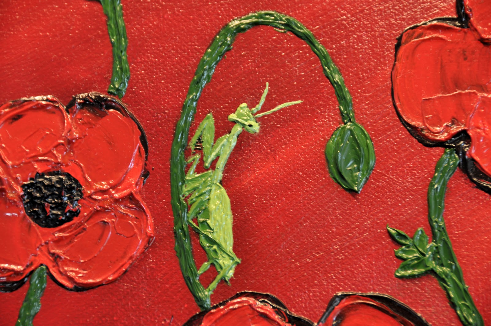
Close up of praying mantis. 
Close up of dragonfly.
Close up of daffodil and grape vine.
Close up of butterfly.
Close up of lady bug.
Close up of pansies and crocus.
Close up of butter fly.
Close up of bumble bee. 
(Did you notice the ants crawling around the painting?)

Oil Colours:
Alizarin Crimson, Cadmium Red Medium, Cadmium Orange, Cadmium Lemon, Cadmium Yellow, Cadmium Yellow Pale, Indian Yellow, Sap Green, French Ultramarine Blue, Prussian Blue, Dioxazine (Windsor Violet), Burn Sienna, Burnt Umber, Ivory Black, Titanium White, Iridescent White.

11 March 2011

Forest of Healing

"Forest of Healing" 2011
Oil on Canvas 18x24"

Disease and ailments of the heart are ever upon us, striving to take the vitality that gives us life.  When all has been taken, and we are weak with nothing left, it is the passions of the heart that keeps us going.

There is a little girl with a chronic health condition who often frequents Primary Children's and art is the passion that keeps her going during her long visits to the hospital.  Recently I offered to give her oil painting lessons, and the above composition was painted with her.  For these reason I titled the pieces "Forest of Healing".  The piece will be given to my sister as a thank you for her contribution to Primary Children's play therapy programs.

Addendum:
The little girl that I referred to in the above passage passed away this Memorial Day due to complications of cystic fibrosis.  She passed at 12 years of age, the past 7 of which I have been privileged to share with her.  

20 October 2010

The Road Not Taken

"The Road Not Taken" 2009
Oil on Canvas 36x48"
"Two road diverged in a yellow wood,
and sorry I could not travel both
And be one traveler, long I stood
And looked down one as far as I could
to where it bend in the undergrowth.

Then took the other, as just as fair,
And having perhaps the better claim,
Because it was grassy and wanted wear;
Though as for that the passing there
Had worn them really about the same.  

And both that morning equally lay
In leaves no step had trodden black.
Oh, I kept the first for another day!
Yet knowing how way leads on to way,
I doubted if I should ever come back.

I shall be telling this with a sigh
Somewhere ages and ages hence:
Two roads diverged in a wood, and I--
I took the one less traveled by, 
And that has made all the difference."
-Robert Frost

For some painting is an expression of beauty, it is to create something that is ascetically pleasing.  For others it is to create something that moves the viewer to emotion, to create an impact on the life of the viewer.  And yet for others it is personal expression, filled with symbolism that may be privy only to the artist himself, and a select few others.  For me, each painting lies to some degree on each of these axes, which may vary from painting to painting.  The above composition I chose to paint simply out of a desire to attempt a technique of painting where the palette knife is used in place of the brush.  (When viewing the piece, bear in mind this was my first attempt at the technique and many mistakes were made.)  For an artist such as myself, who is very detail oriented, it posses a challenge representing the subject matter in such crude terms, yet the technique presents sensational texture, which imparts to the painting a sense of relief sculpture.  The beautiful reds, greens, and golds found in fall foliage are complemented beautifully by such texture.  The technique, though crude, can be quite challenging.  One of the greatest advantages of oil painting lies in its forgiving nature, but paintings that are textured as this are difficult to rework (thus there are many elements in the above painting that I would change if reworking it was not nigh unto impossible).

In regards to meaning, the symbolism of the poem and the painting are one and the same.  It should be noted, though, that there are at least two accepted interpretations of this poem.  Frost himself warns against interpreting the poem simply.  The popular interpretation indicates that the viewer has taken the road 'less traveled by', and that their non-conformist path has 'made all the difference'. The ironic interpretation takes into account the statements indicating that the two roads 'equally lay', have been equally worn, yet it is in retrospect that the viewer will one day see the roads as being uniquely different.  The choice of one road over that of another could not have been made under pretense of choosing the non-conforming path, as both paths were equally worn, but it is through rationalization of the personal decisions that one makes that yields to the two paths visible differences whereby their choices may be attributed to, choices that have 'made all the difference'.  

19 October 2010

Kiss of Spring

"Kiss of Spring" 2008
Oil on Canvas 16x20"

Painting from life has the advantage that elements of colour and lighting are given to you, yet the complexity of life presents a challenge.  The artist must mediate between representing the finest details of the subject, and simplifying those elements of the subject that would detract from the composition.  This theme is well represented not only in this composition, but also in the symbolic meaning that the painting holds.  The two spring flowers painted here represent the male and female figure just before kissing.  The daffodil, the male, is leaning in to the tulip, the female, with his 'hand' extending behind her 'head', and her 'hand' upon his 'chest'.  The flowers themselves, being spring flowers, symbolize a time when new life and love are bursting forth from the long winters of life, yet, I chose to leave the flowers in black and white symbolizing their simplicity and insignificance in such a vast world.  But, it is just this, their simple beauty, that overflows from their own sphere and into the world encompassing them, yielding to the world a vibrancy and life much greater than their own.  It may be noted that the colour behind the daffodil is that of the tulip, and that the colour behind the tulip is that of the daffodil, and the space lying between, where their lips will meet, is a beautiful fusion of their own colours.  This gives representation of the two lovers giving themselves to the other and becoming one through their love.

Below you will find the original picture that I took of these two 'young lovers', and thought the representations of the artistic photography is different from the symbolism found in the painting, it yet may be noted how emphasizing particular details, while simplifying others, can bring meaning to a composition that is otherwise nothing more than ascetically pleasing.  


Flowers of Eden

"Flowers of Eden" 2008
Oil on Canvas 16x20"
Painting abstracts can be quite relaxing.  I typically start out with a general idea of what I want to paint, yet my planning of the composition is minimal.  When I approach this style, I like to use the colours strait from the tube, in their pure form, without adding medium, or mixing of the paints on the palette.  The bright vibrancy that result from unmixed hues complements the free flowing nature of abstract art, and it enhances the enjoyment of the process.  After giving my first abstract away, I had a strong desire to try the style again.  I chose some of my favorite colours from my palette, squeezed them directly on to the canvas in such a way that I thought would prove to mix well as the paint blended, and I began painting without much further thought of how the painting was to evolve.  In looking at the finished product, I thought that the swirls looked like flowers from another world, thus I titled the painting "Flowers of Eden" signifying that these flowers were coming from a long lost world that has long been absent of man's corrosive touch.  As time has progressed, and my knowledge of science with it, the title that I have chosen for this pieces has ever become more fitting.  As I have learned about the origins of life, from the perspective of evolutionary biology, I have come to understand that life evolved initially in the oceans before it progressed to land, and as Eden is the biblical origin of life, it was fitting that these flowers, which have the appearance of sea anemones, represent the flowers of an underwater Eden as life came into being.  

15 October 2010

Untitled 2007

"Untitled" 2007
Oil on Canvas 14x18" 
Oil painting is more than transposing paint to the canvas, it is more than creating an ascetically pleasing
picture.  The process, for some, is where the meaning lies, more so than can be derived in the collection of brush strokes upon the canvas.  This painting was painted at a time when my dad was undergoing treatment for Lymphoma.  Before he returned home, I brought my paints and brushes to the hotel and dad and I painted together.  Dad didn't really want to 'waste' a canvas, so he sat on one side of the table, and I the other, and separately we painting our own picture together on the same canvas.  For me I was undertaking a monochromatic attempt to portray an ocean scene, using only shades and tints of cobalt blue, dad was undertaking a mountain scene.  But this painting session was more than creating a monochromatic study, or capturing the majesty of the mountain, it was about creating a bond between father and son.  It isn't a great painting, and will not likely survive through the years, but the meaning herein is found in the process, and the bond created therein cannot be ravaged by the rags of time.