"Colours of Spring" gives representation of the vibrancy and life of Spring, as the world comes out of the long and dreary of Winter. Accordingly, you will find this piece to liven up the room with the bright and richly textured flowers popping out from the surface of the painting. I chose the dimensions of the painting with the idea that it would best be showcased above the archway leading into a room, inviting guest to feel enlivened by what lies beyond. It began as simple painting that I intended on completing in a single session working wet-in-wet, or alla prima. I wanted a bright painting with spontaneous brush strokes. I painted a rainbow of colours, from deep alizarin crimson to the jewel like French ultramarine. After combining primaries to make secondaries I placed dabs of titanium white paint directly from the tube on to the canvas. I then proceeded to spread the white paint into spring flowers, creating a tint of the colour below. The idea was that the background colour represented fields of flowers that blended together on the horizon creating a single mass of colour, while the flowers in the foreground were close enough to distinguish.
 |
| Original composition. |
The unfortunate nature of oil paint is that it leaves your painting vulnerable to the environment for an extended period of time while the paint dries. As a result of my negligence to protect the painting during this critical time a thick layer of dust was cemented into the wet paint from the air conditioning vent above. I was rather dissatisfied with the results so I sanded the painting and began afresh. Yet, I could not simply repaint it as I had before because I had used thick paint, resulting in obvious brush marks that would not match between the old and new. To solve this problem I decided to magnify the textural difference between the flowers and the background by using a palate knife to paint over the flowers. To create variety in the flower's colouration I painted the flowers in two steps. I first painted a dark colour creating the flower's outline, and then I painted a lighter colour above, allowing the two to mix as I spread the paint with the palate knife.
 |
| Flowers layers. |
At this point my simple flower painting had become much more complex, and what was suppose to have been completed in a single painting session was taking multiple painting session, with over 100 hours invested into the final piece.
 |
| Spring flowers: Poppies, daises, daffodils, grape vine, pansies, crocus. |
As the painting progressed over months I began to develop new ideas to incorporate into the piece. The painting represented the vibrancy and life of Spring, yet how could I represent the life of Spring without including the diversity of life that the world contains. Thus I chose to accent each panel with a complementary colour of life. In the end, I arrived at a much more dynamic painting.
 |
"Colours of Spring" 2011
Oil on Canvas 12x48" |
 |
| Close up of poppies and daisies. |
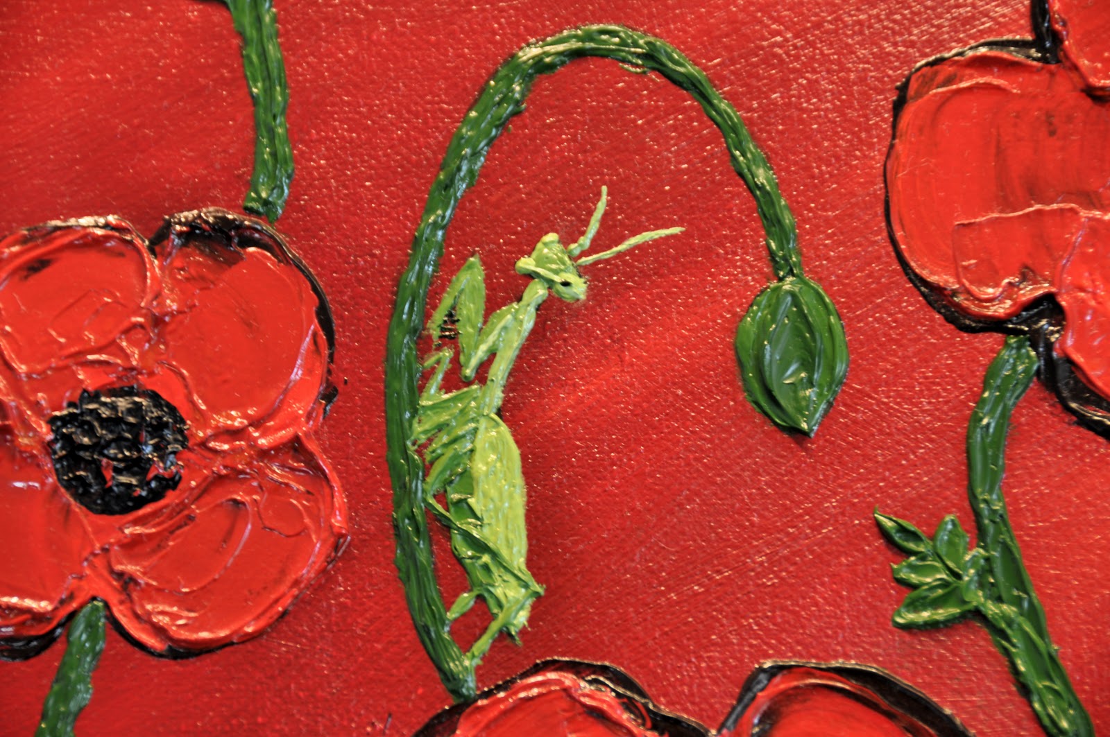
 |
| Close up of praying mantis. |
 |
| Close up of dragonfly. |
 |
| Close up of daffodil and grape vine. |
 |
| Close up of butterfly. |
 |
| Close up of lady bug. |
 |
| Close up of pansies and crocus. |
 |
| Close up of butter fly. |
 |
| Close up of bumble bee. |
(Did you notice the ants crawling around the painting?)
Oil Colours:
Alizarin Crimson, Cadmium Red Medium, Cadmium Orange, Cadmium Lemon, Cadmium Yellow, Cadmium Yellow Pale, Indian Yellow, Sap Green, French Ultramarine Blue, Prussian Blue, Dioxazine (Windsor Violet), Burn Sienna, Burnt Umber, Ivory Black, Titanium White, Iridescent White.